Admin Design Pattern Library
Buttons
Buttons bring attention to actions on the screen. This article will cover the use of general buttons on Magento.
For solutions not described in this topic, please refer to other related patterns or contact the Magento UX Design team.
When to Use
Buttons should be used anywhere a call to action(CTA) is needed. Discretion should be used when deciding when to use a button vs. a hyperlink, icon, or another call to action.
When Not to Use
- Do not use buttons to indicate actions that are better suited as hyperlinks such
as “Cancel”. Some exceptions may apply. - Do not use more than one primary page level action on a single page for different actions. Some exceptions may apply.
- Do not use buttons to indicate a link to more information or to a task not related to primary flow.
Variations
Variations of this pattern are as follows, and will be detailed in the section on Appearance and behavior:
- Page level buttons are to be used for calls to action on pages.
- Form level buttons are to be used on forms.
- Table level buttons are to be used within tables or data grids
Buttons will be take on one of the below variations.
| Page Level | Form Level | Table Level |
|---|---|---|
| Primary | Primary | Regular |
| Secondary | Secondary | Icon |
| Toggle | Toggle | Toggle |
| Tertiary | Tertiary | Tertiary |
| Table Button | Table Button | Table Button |
| Primary Dropdown | Primary Dropdown | Primary Dropdown |
| Secondary Dropdown | Secondary Dropdown | Secondary Dropdown |
CSS style classes will need to be established for any buttons that require a custom defined style.
Styles and Behavior
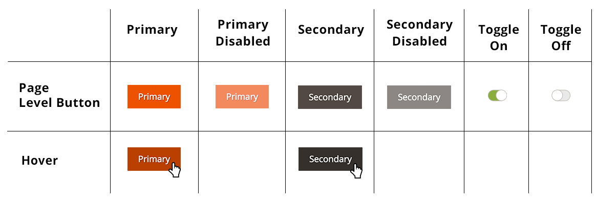
1. Page Level Button
Font details
Family: Open Sans Semibold;
Size: 17px; (or 1.125em based on 14px default font)
Color: #ffffff
Background color
Primary: #eb5202; (CSS-$magento-orange-color)
Secondary: #514943; (CSS-$magento-dark-brown)
Hover background color
Primary: # aa2d00;
Secondary: # 282421;
Disabled style
Opacity: 50%
Page Level Button Padding
Top/Bottom: 11px
Left/Right: 20px
Margin Spacing
Top/Bottom margin spacing should not be less than 10px
Left/Right margin spacing should not be less than 20px
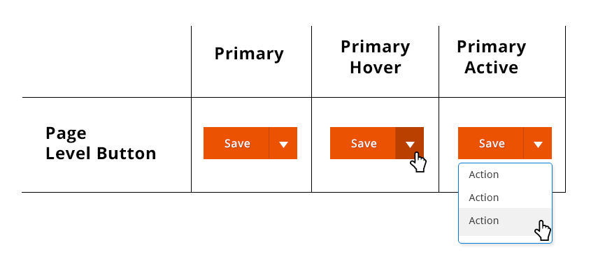
2. Dropdown Buttons
Font details
Family: Open Sans Semibold;
Size: 17px; (or 1.125em based on 14px default font)
Color: #ffffff
Background color
Primary: #eb5202; (CSS-$magento-orange-color)
Secondary: #514943; (CSS-$magento-dark-brown)
Hover background color
Primary: # aa2d00;
Secondary: #28242;
Dropdown stroke: #337ab7;
Dropdown Highlight: #eeeeee
Disabled style
Opacity: 50%
Page Level Button Padding
Top/Bottom: 11px
Left/Right: 20px
Margin Spacing
Top/Bottom margin spacing should not be less than 10px
Left/Right margin spacing should not be less than 20px
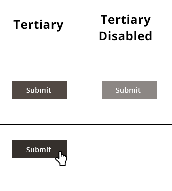
3. Tertiary Buttons
Font details
Family: Open Sans Semibold;
Size: 14px; (or .750em based on 14px default font)
Color: #ffffff
Background colors
Secondary: #514943; (CSS-$magento-dark-brown)
Hover background color
Secondary: #28242;
Disabled style
Opacity: 50%
Tertiary Level Button Padding
Top/Bottom: 12px
Left/Right: 30px
Margin Spacing
Top/Bottom margin spacing should not be less than 10px
Left/Right margin spacing should not be less than 20px
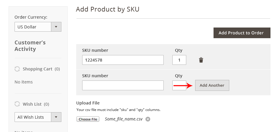
Tertiary Button Example:
4. Quaternary Buttons
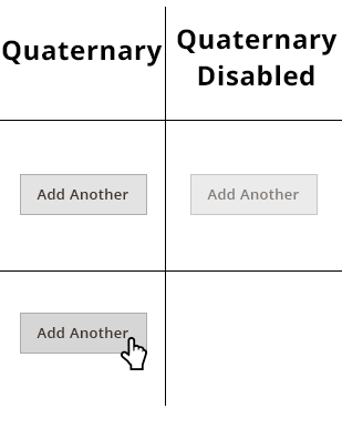
Quaternary buttons are only after all the buttons hierarchy have been used.
Font details
Family: Open Sans Semibold;
Size: 13px; (or .750em based on 14px default font)
Color: #322923
Background colors
Light: #dcdcdc;
Border
Solid
Width: 1px;
Border color: #9d9d9d;
Hover background color
Dark:#cccccc;
Disabled style
Opacity: 50%
Tertiary Level Button Padding
Top/Bottom: 12px
Left/Right: 15px
Margin Spacing
Top/Bottom margin spacing should should not be less than 10px
Left/Right margin spacing should not be less than 10px
Quaternary Button Example:
5. Toggle Buttons
The toggle button acts like a checkbox. When you touch/click on it, the state toggles between “yes” and “no” and/or “on” and “off”.
When to Use/When Not to Use
Use toggle for:
- Binary selection (true/false) when only a single option can be set
- When multiple non-required selections can be set
- In relation to other form elements when needed
Do not use checkboxes if: - Multiple options need visibility
Variations
No additional variations.
Font details
Family: Open Sans Semibold;
Size: 13px; (or .750em based on 14px default font)
Color: #322923
Background colors
Light: #dcdcdc;
Border
Solid
Width: 1px;
Border color: #9d9d9d;
Active background color
Dark:#cccccc;
Inactive background color
Dark:#cccccc;
Disabled style
Opacity: 50%
Tertiary Level Button Padding
Top/Bottom: 12px
Left/Right: 15px
Margin Spacing
Top/Bottom margin spacing should should not be less than 10px
Left/Right margin spacing should not be less than 10px
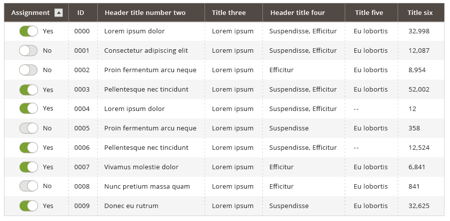
Examples of toggle buttons:
Accessibility
PC: https://support.microsoft.com/en-us/help/12445/windows-keyboard-shortcuts
OS: http://support.apple.com/en-us/HT201236
(Keyboard shortcut same as checkbox)
Assets
Please reach out to the Magento UX Design team if you need anything else.